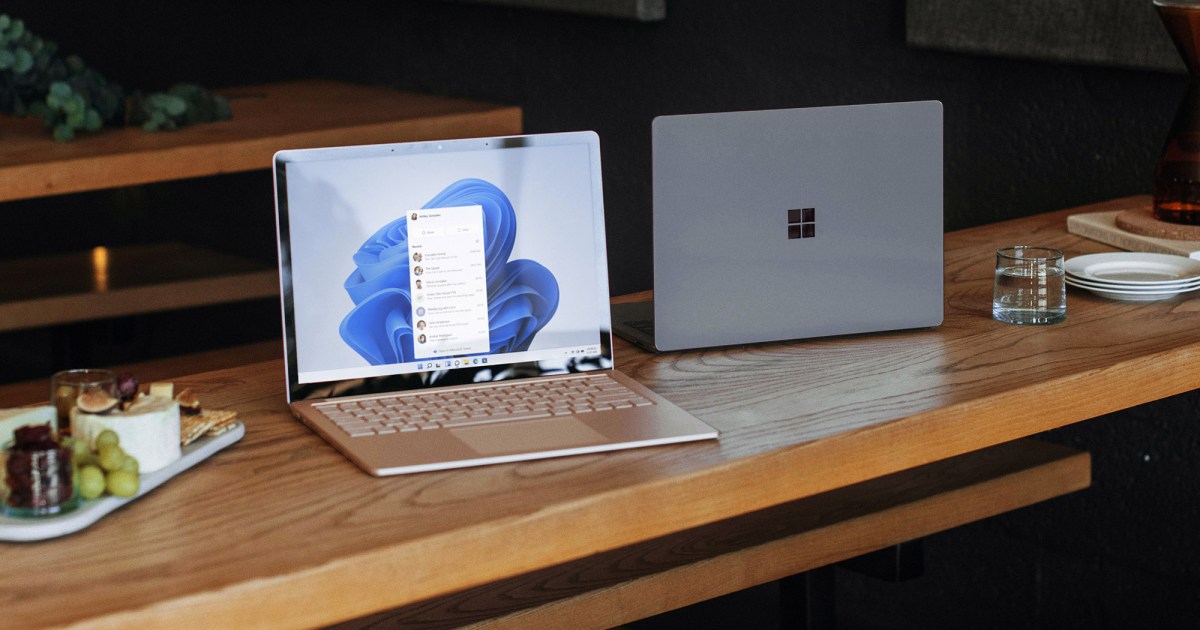
Judging from the first Windows 11 Insider Preview, Microsoft’s next OS will be much more than a mere Windows 10 update. The company is fundamentally shifting how many aspects of Windows work, with a centered taskbar and redesigned Start menu, among other changes. But it’s still Windows, so at its core, it still works like it always has. Microsoft leaned into the focus on productivity with Windows 10 and subtler improvements that make for a more pleasant user experience. Now, Windows 11 feels like an OS that will please PC diehards and mainstream users.
Gallery: Windows 11 Insider Preview
At first glance, the Windows 11 Insider Preview, which started rolling out on Monday, doesn’t look much different from the leaked build we covered a few weeks ago. The centered and icon-filled taskbar still looks distinctly Mac-like; the rounded window corners give off a slightly more polished vibe, and the redesigned Start menu is sure to be controversial. It features pinned app shortcuts up top, recommended files at the bottom, and a link in the top right to see the entire unfiltered Start Menu.
This Start menu is certainly different, but after testing the leaked build for two weeks, I prefer the changes. I’ve never met anyone who used the Live Tiles in Windows 10’s Start menu, and those were just a distilled remnant from Windows 8’s horrific full-screen Start page. It’s nice to be rid of that legacy once and for all.
As I dug further into the preview build, I noticed minor tweaks throughout that just felt, well, nice. Instead of combining notifications and system shortcuts into a single right-hand pane, they’re now broken up across two screens. Hitting the clock in the Windows 11 taskbar brings up all your notifications and a full calendar. Meanwhile, the system shortcutsare combined into a single screen that pops up when you press the Wi-Fi, sound, or battery icons.
From there, you can join other wireless networks and turn Bluetooth on and off, along with airplane, battery saver, or Focus assist modes. Sliders along the bottom also let you manage your volume and screen brightness. This isn’t that different from Windows 10, but the overall look is a lot cleaner and easier to read. (Maybe I’m just sick of hitting the “More options” to expand Windows 10’s shortcut settings.)
Microsoft is also clearly pushing a taskbar UI that only features icons in Windows 11. The company started doing it with Windows 7, but until Windows 10, you always had the option to turn on labels for taskbar icons (at least, until they began to pile up too much). Windows 11 no longer has label options, and there’s no indication that Microsoft wants to bring them back. They just don’t fit into the neat aesthetic the company aims for now. While it tended to make Windows look a bit messy, I always liked seeing what a window contained before I clicked on it.
At first, I figured losing labels would be a pain, but I’ve grown used to living with an icon-filled taskbar over the last few weeks. And I’d gladly lose tags in exchange for better multitasking features like this new OS’s revamped window snapping. Now you can hover your mouse pointer over any app’s maximize button to see an array of areas to snap it to, like the top left or bottom right of your screen. It’s much more accurate than dragging a net to a specific spot and hoping Windows automatically snaps it into place.
